Brand Identity • Harpoon Pest Solutions
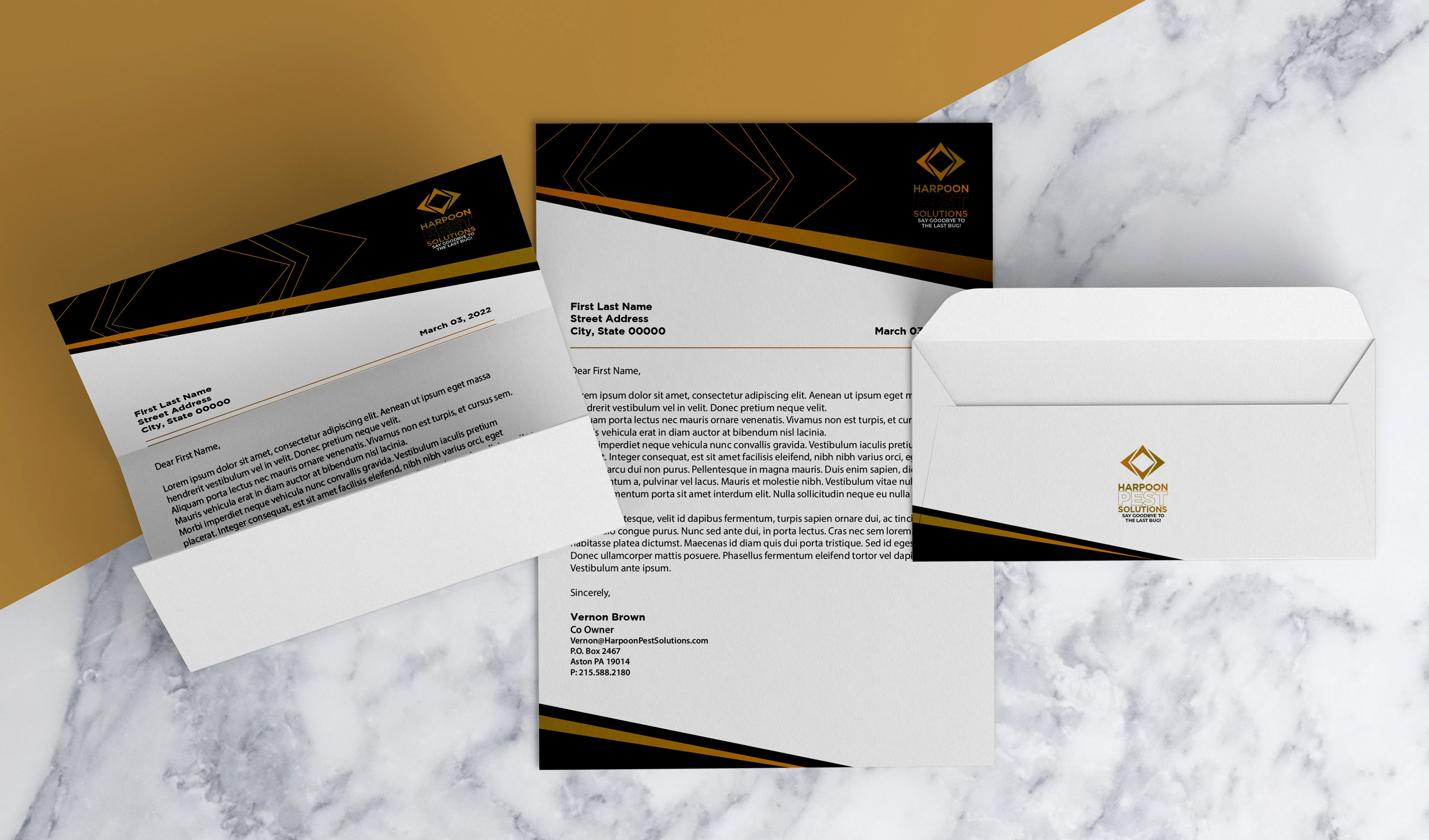
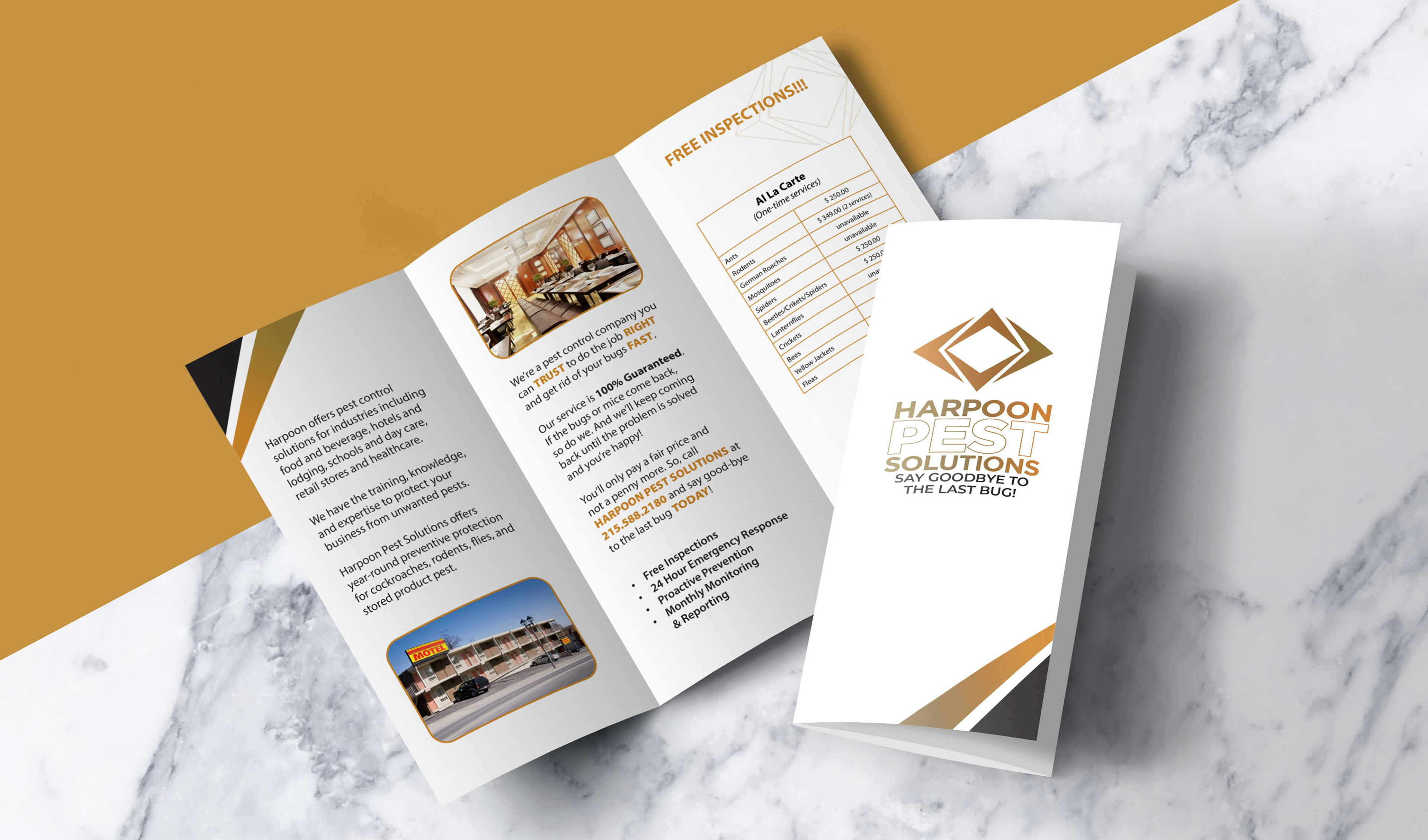
Developed a brand identity and marketing collateral for a pest control company, including business cards, letterhead, and a commercial brochure.
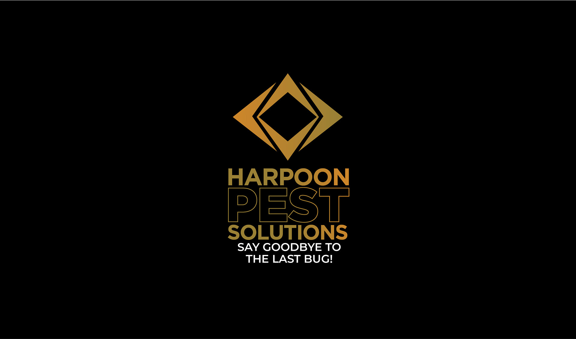
Designed a bold visual system using a black and gold color palette to convey a sense of professionalism and premium service. Created a logo that incorporates directional elements and open space to represent precision, adaptability, and a broad scope of service.
Aligned the identity with the company’s customer-focused approach, ensuring the brand communicates reliability, effectiveness, and confidence across all touchpoints.
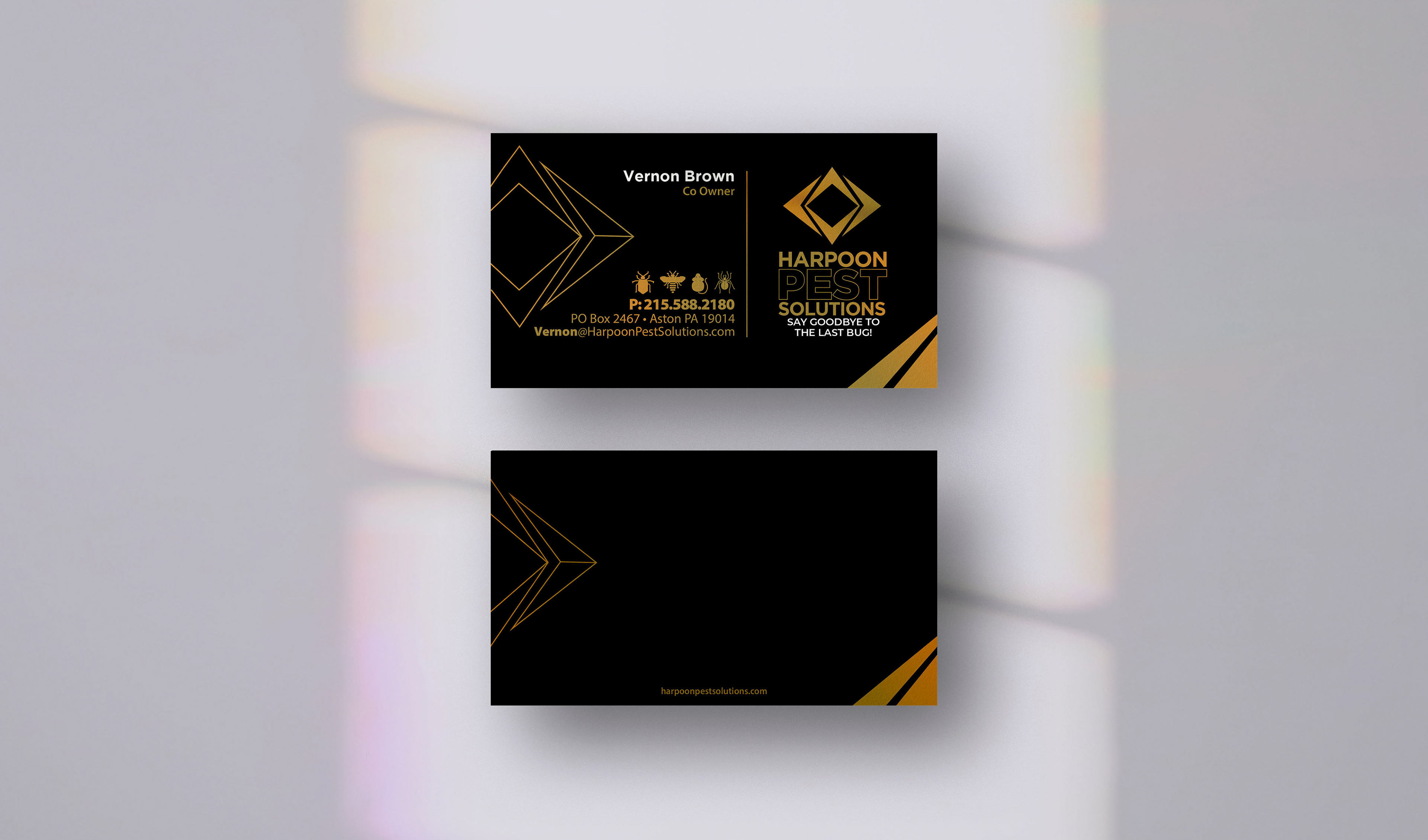
The customers wanted a luxury touch on their business card, letterhead, and commercial brochure design, and I designed it in black and gold. The logo identifies Harpoon Pest Solutions with four elements: An open center signifies our work's broad, encompassing scope, ensuring that every customer is served with excellence and to their complete satisfaction.
Harpoon-sharp left and right arrows signify our cutting-edge, highly effective pest control service plans tailored to each customer’s unique needs, schedules, and more.
Harpoon Pest Solutions is a continual reminder to customers and potential clients that they stand behind their name and every service we provide.
The tagline, or expression, sums up their pledge to each customer: “Say Goodbye to the Last Bug.”